JobApp
UI/UX
Background
Impellam is an umbrella company with 18 recruitment agencies in various sectors. Each brand has its own website on which they post job ads. The research suggested more people were looking for jobs via their mobile, Impellam wanted an encompassing job searching app to accommodate for this market.
Role
UX Researcher
Designer
Tools
Sketch
Optimal Workshop
Skype (for interviews)
Date
2018
Company
Impellam
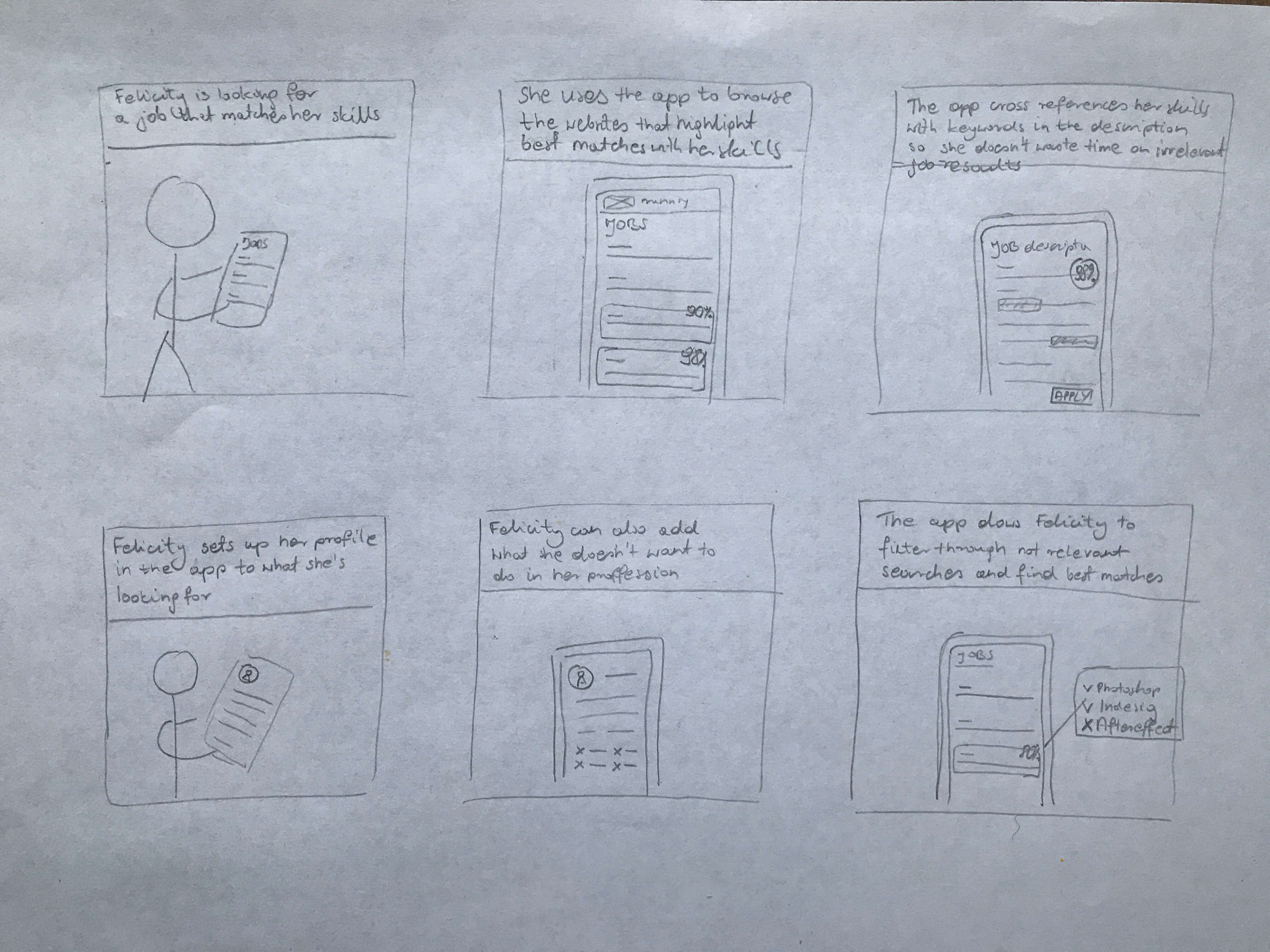
The challenge
Often a job's description is not relevant to the job title or the requirements don’t match the job seekers skills. This process can be quite frustrating and time-consuming when looking for a new job.
The process
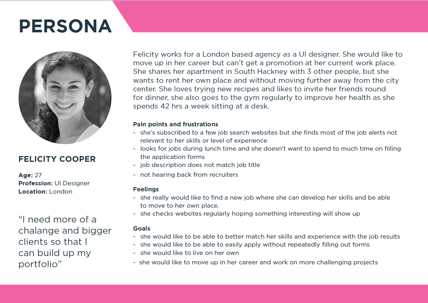
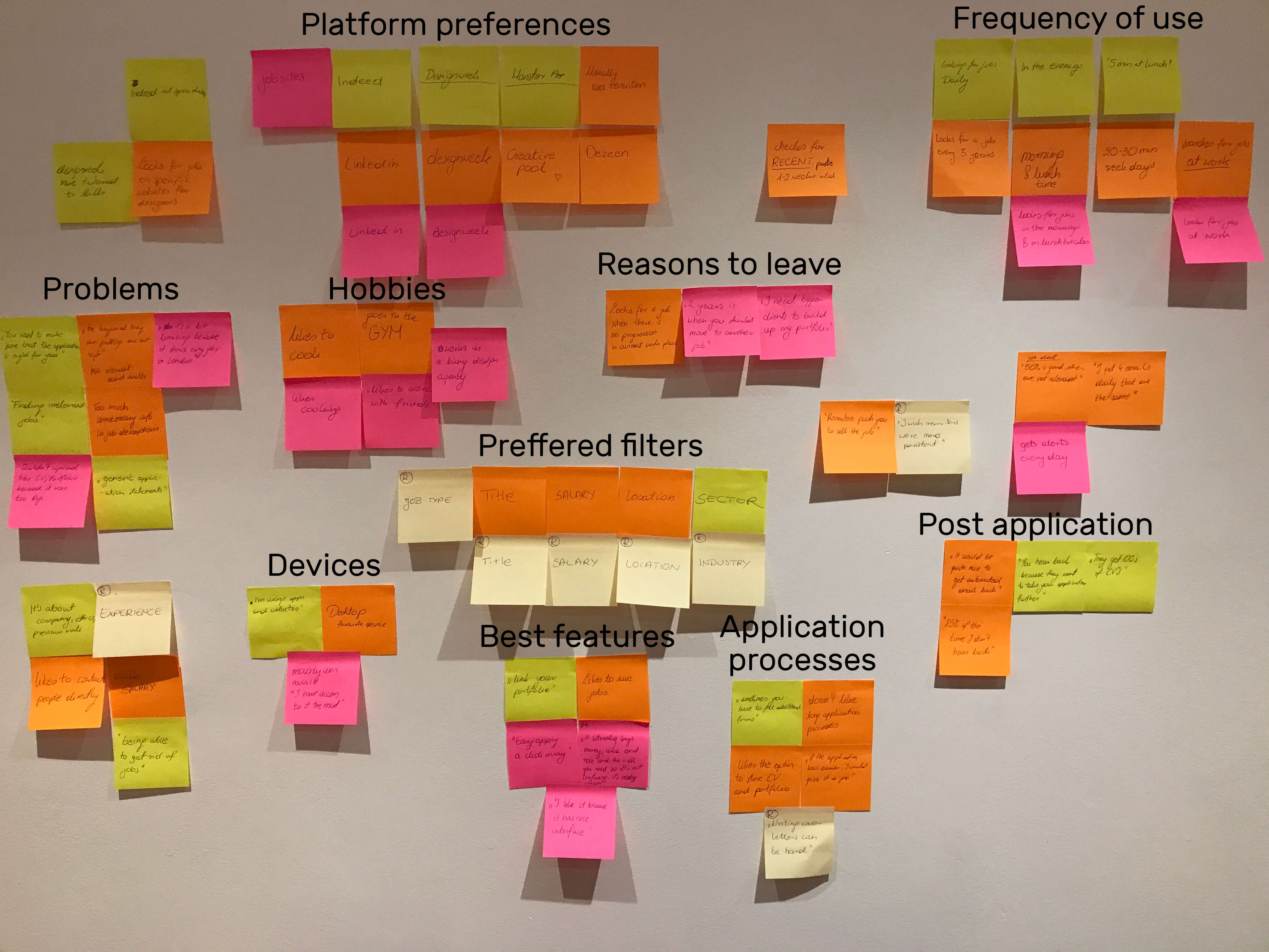
Have conducted interviews with active job seekers to find out how they engage with the process and what are the problems they encounter.
Some of the pain points revealed in interviews were:
• Irrelevant job descriptions
• Not tailored job alerts
• No response after applying for jobs
• Having to search for a company outside of the platform
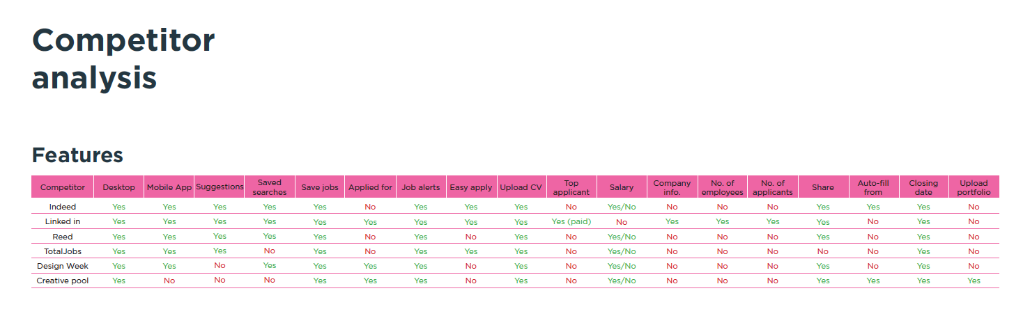
I created a list of job search engines that were most popular amongst the interviewees. Then I have analysed what they offer their users and matched that with our user's feedback. with this information, I put together a list of features that would be most valuable for our users and prioritized them.
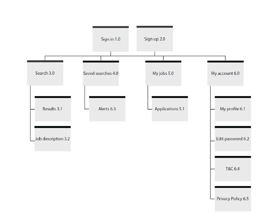
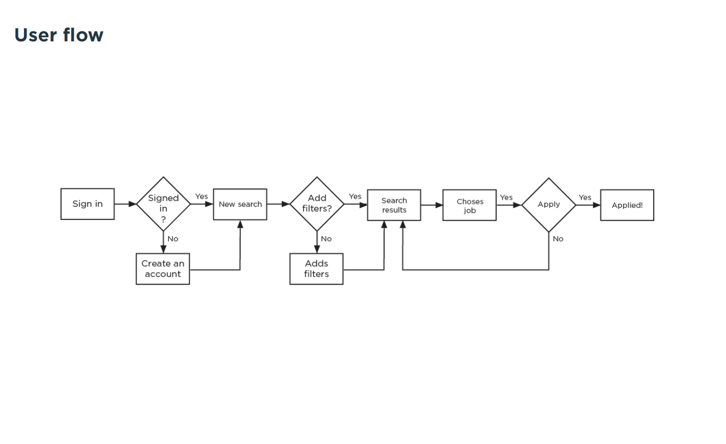
The solution
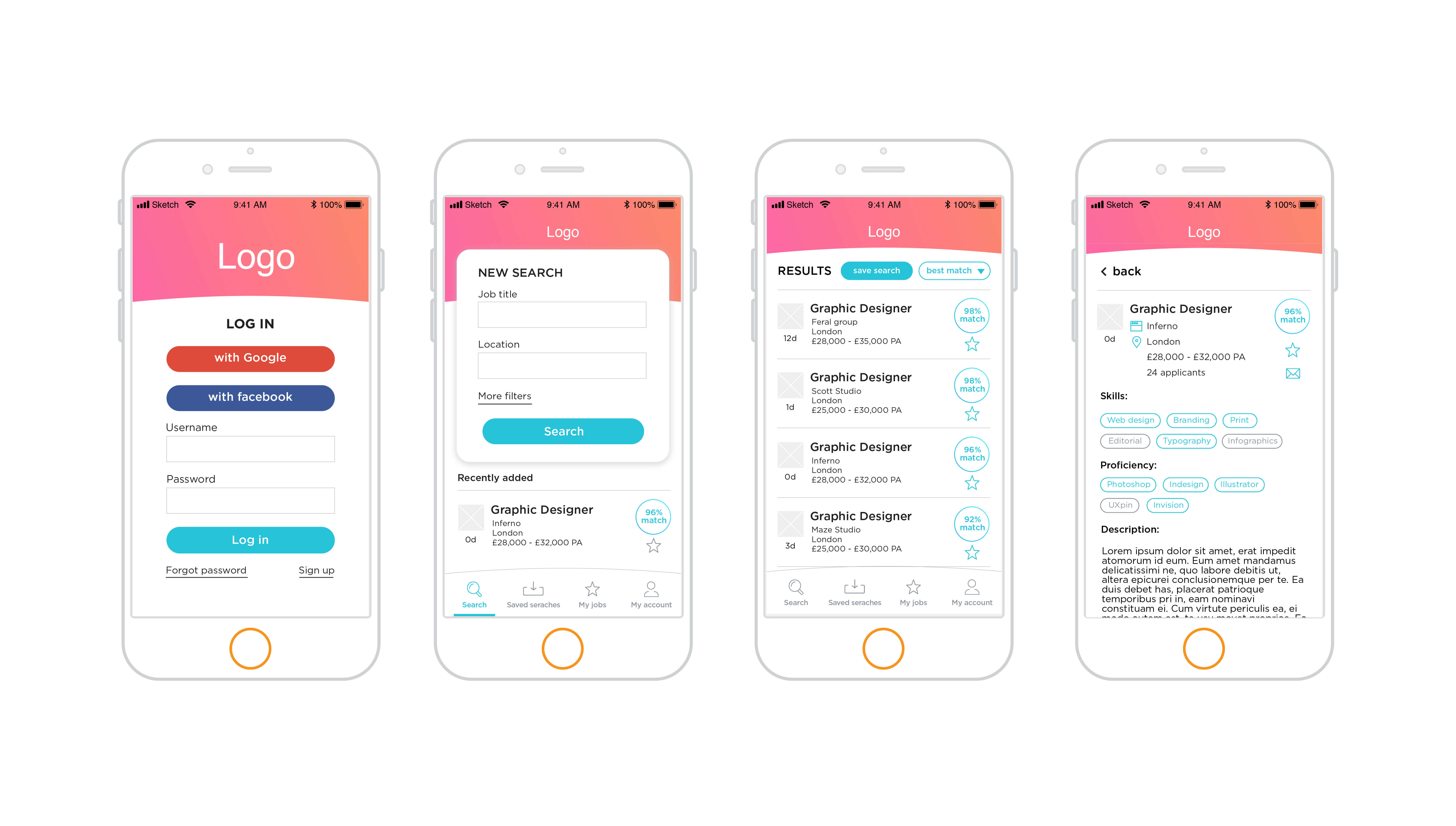
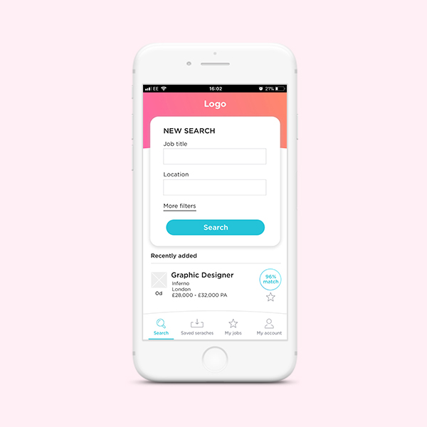
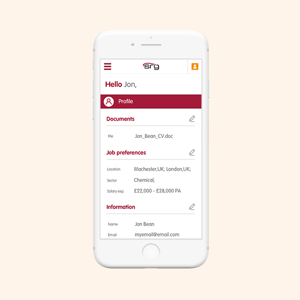
I found a number of features that could possibly solve the issues our users were experiencing.
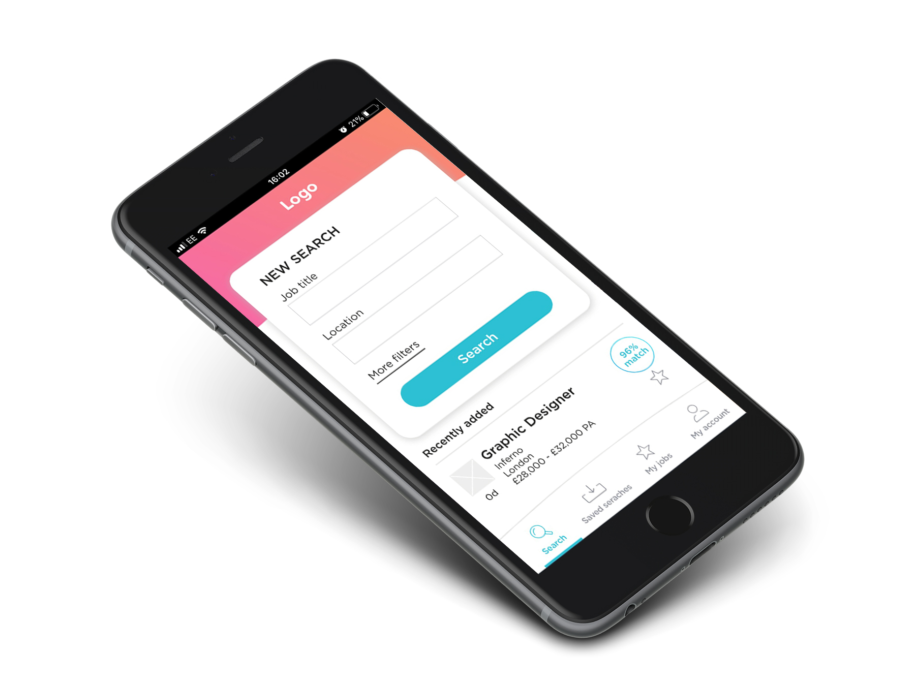
The key feature was to sort the user's search by ads which matched the highest percentage of relevant skills. This would also be useful when sending job alerts. Including a one-click apply option would speed up the process for registered users. The first round of testing went very well, I received positive feedback on the idea of matching the skills as well as comments about what could be possibly improved.
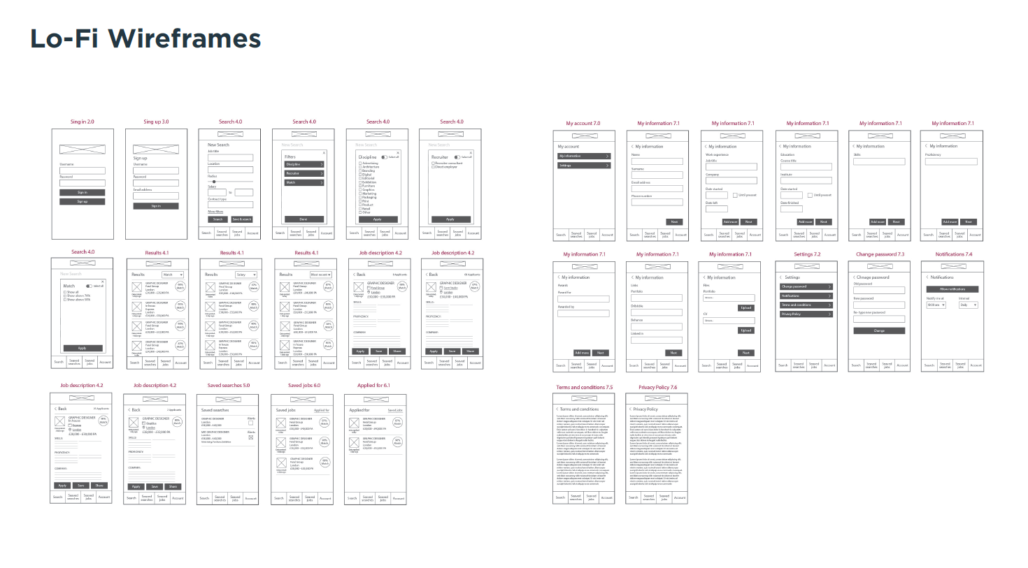
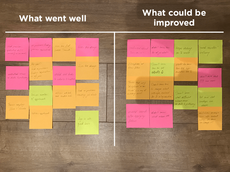
Feedback from users was to reduce initial search fields and add them to advance filters. Some of the terminologies were not clear and users expected the percentage to expand with details of the match if they clicked on it.
Feedback from users was to reduce initial search fields and add them to advance filters. Some of the terminologies were not clear and users expected the percentage to expand with details of the match if they clicked on it.
Feedback from the final test was better and all previous issues had been addressed. Users had no problems navigating through the app, the overall user experience was clear and participants understood the concept of matching jobs with their skills.
Feedback from the final test was better and all previous issues had been addressed. Users had no problems navigating through the app, the overall user experience was clear and participants understood the concept of matching jobs with their skills.
Selected Works
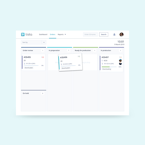
Tista - Task managementWeb & mobile app
JobAppApp design
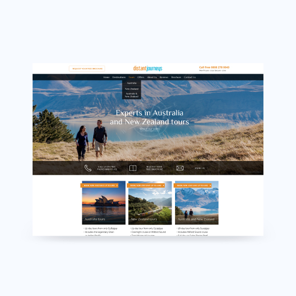
Distant JourneysWeb design
Registration & My accountWeb re-design
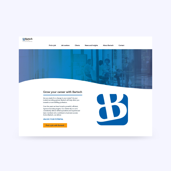
BartechWeb design
AMFApp design
PXI-eBranding
MetiDataWeb design and Development

Tate ApprenticeshipMarketing Campaign
Aviation Salary Survey 2018Publication

Beyond LuxuryBranding

FeniksTypeface design
Daily UIUI practice