
Tista
App design
Background
Task management system for a company that specialises in image editing services for e-commerce and photography.
Role
UX Researcher
UI Designer
Tools
Sketch
Adobe Illustrator
Date
2019
Company
Clipping Path India
About the company
CPI is a photo editing company with offices globally. There is a complex structure in the business with 7 different roles that each have different responsibilities when delivering services to clients. From the designer to the administrator, each role heavily relied on spreadsheets to keep track of daily workload across all venues. This system was inefficient and error-prone.
The company approached me to design a task management app solely dedicated to their business. The main goal was to improve efficiency across the teams, be able to better track orders and time spend on different task categories so that they can give their clients the best service.
The challenge
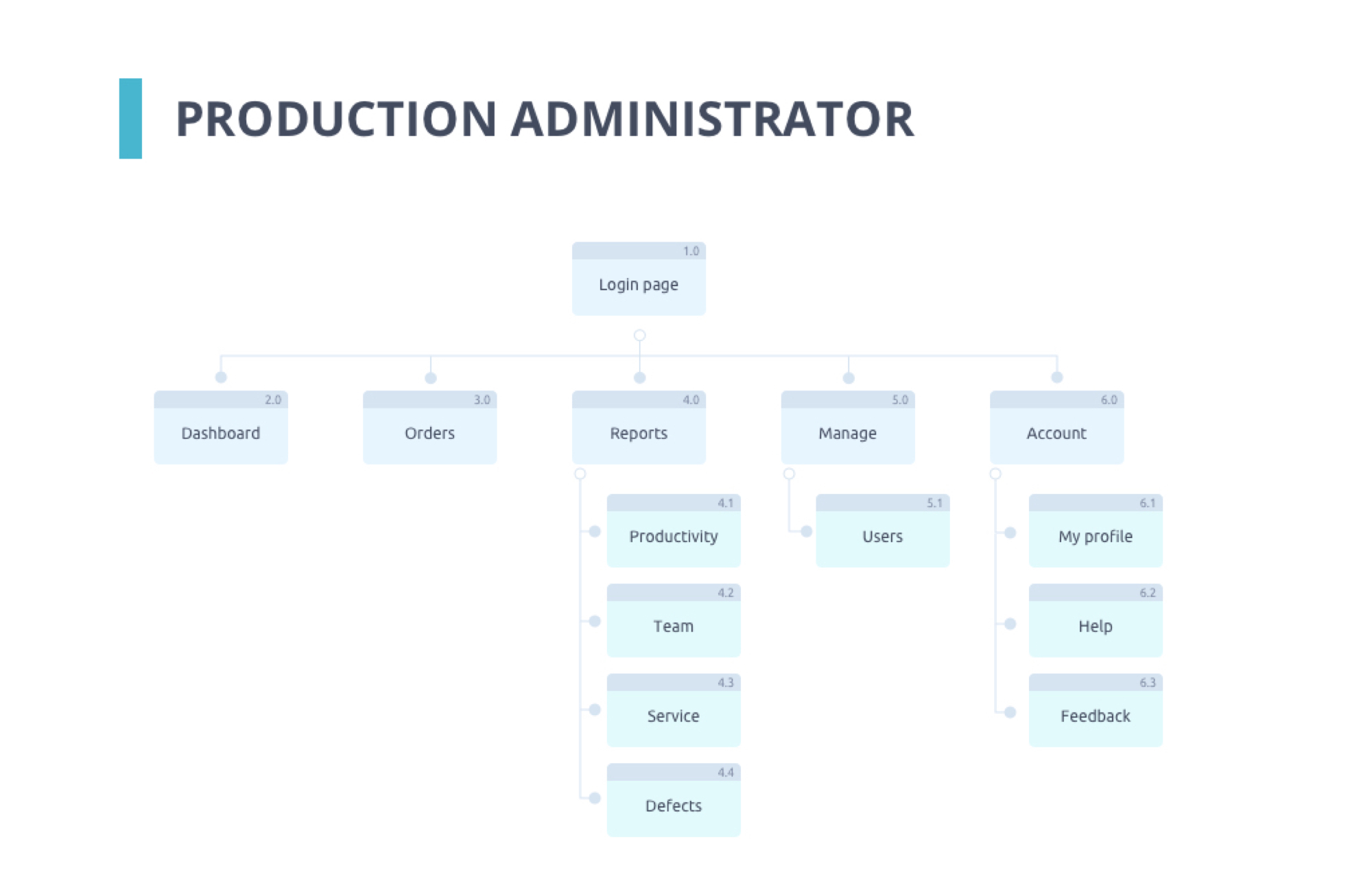
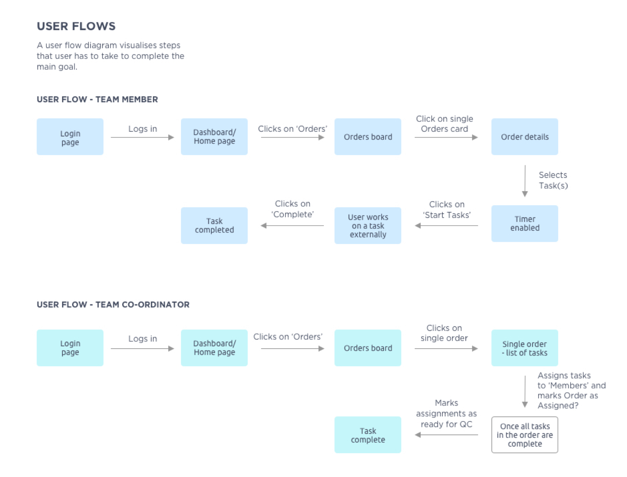
My client shared with me spreadsheets of data related to their current order processes. We collaborated on creating app architecture for each of the roles and user flows.
Each persona had different goals and needs. The app had to address all the requirements. The discovery process was often confusing and new requirements kept coming up, sometimes even new roles.
The process
The design process was recorded in Trello so that all members of the team could collaborate on next steps. The first task was to design a Logo and brand guidelines for the new product.
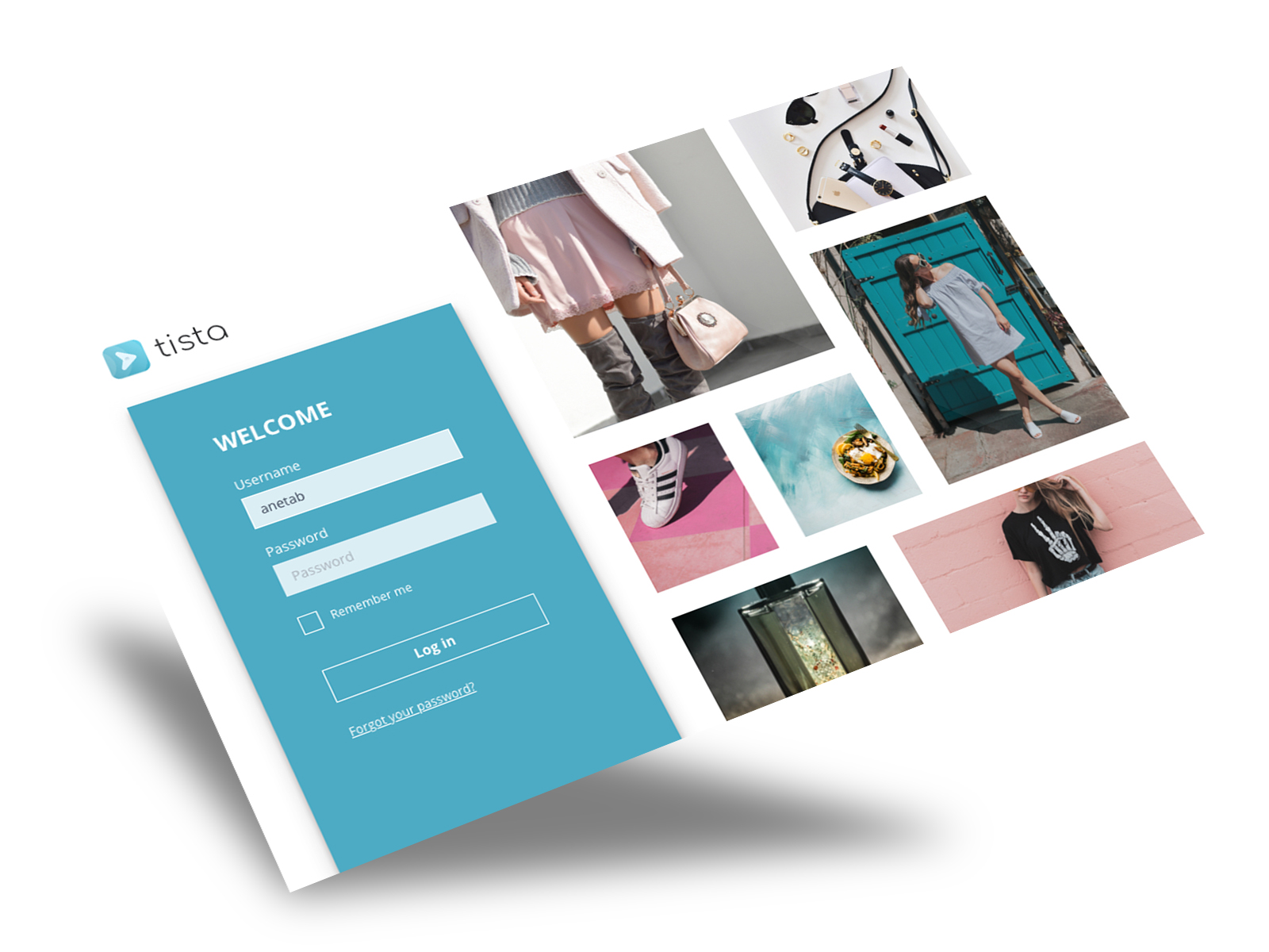
My client wanted the app to be called TISTA after a river that flows through Bangladesh, where they have their headquarters.
I wanted the concept of the logo to encapsulate my client's vision. The icon background is blue with white opacity elements that look like waves. The arrow symbolises moving forward and the square shape represents a task card.
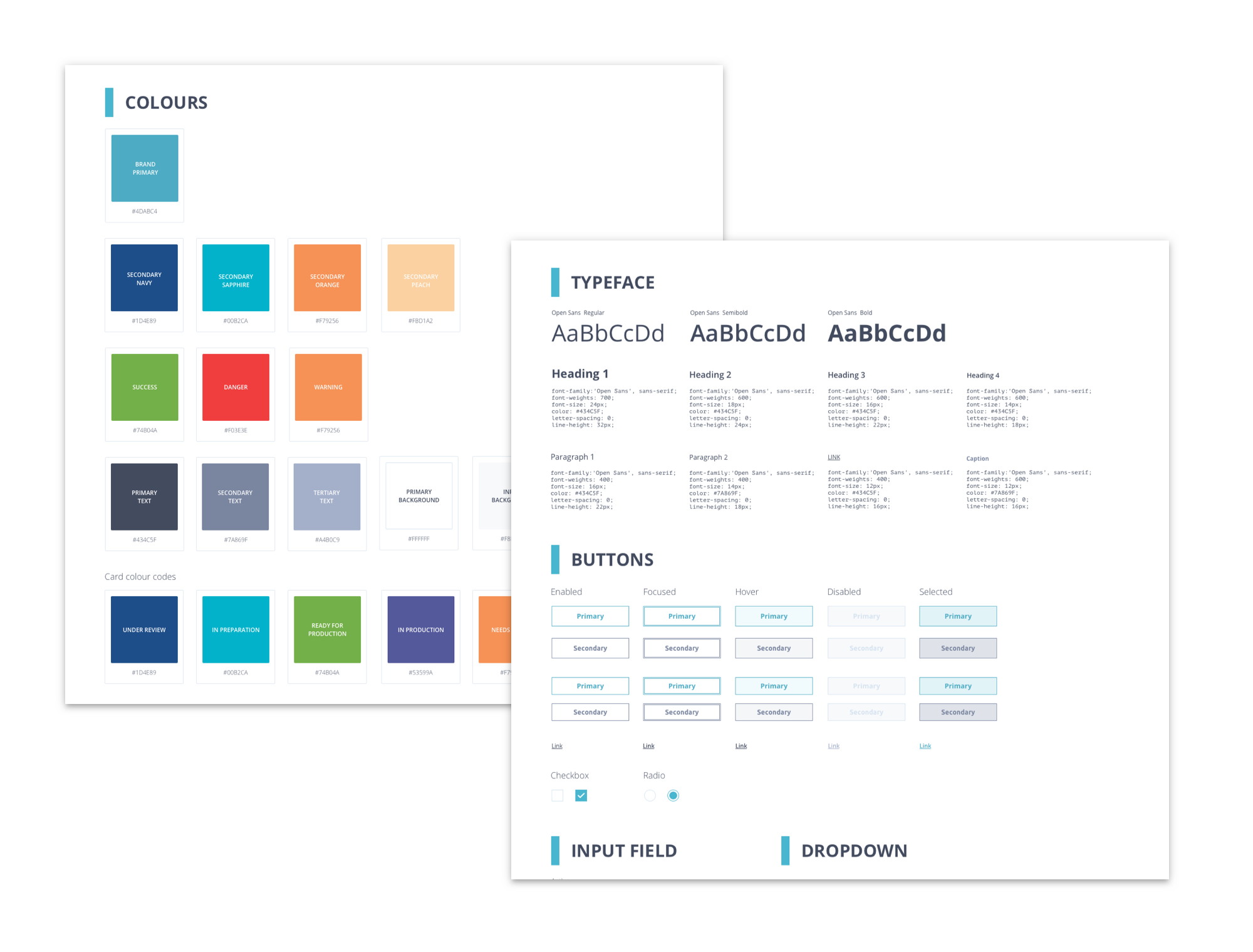
The next step was to develop the app style guide. Decide on colours, typefaces, UI elements, a grid, spacing and bespoke icon style.
For this, I created a document in Sketch and shared it with the rest of the team.
Low fidelity wireframes
I have started creating low fidelity wireframes to get an idea of how the main pages could look. It is easier to edit and test screens in this state before adding the details.
Low fidelity designs allow people to concentrate on the functionality of the app first. Presenting polished designs to a client can often be distracting as they will pay attention to colours icons etc. and some important functions might get missed.
Responsive app
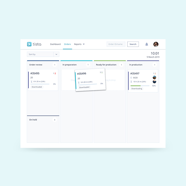
The app had to work on both desktop and mobile. The challenge was to make sure that the kanban board was still working fine on the mobile.
In the design, most of the content is responsive and adjusts to the width of the device, whereas the kanban board would allow the user to scroll to the right to see other categories (min1 & max 4).
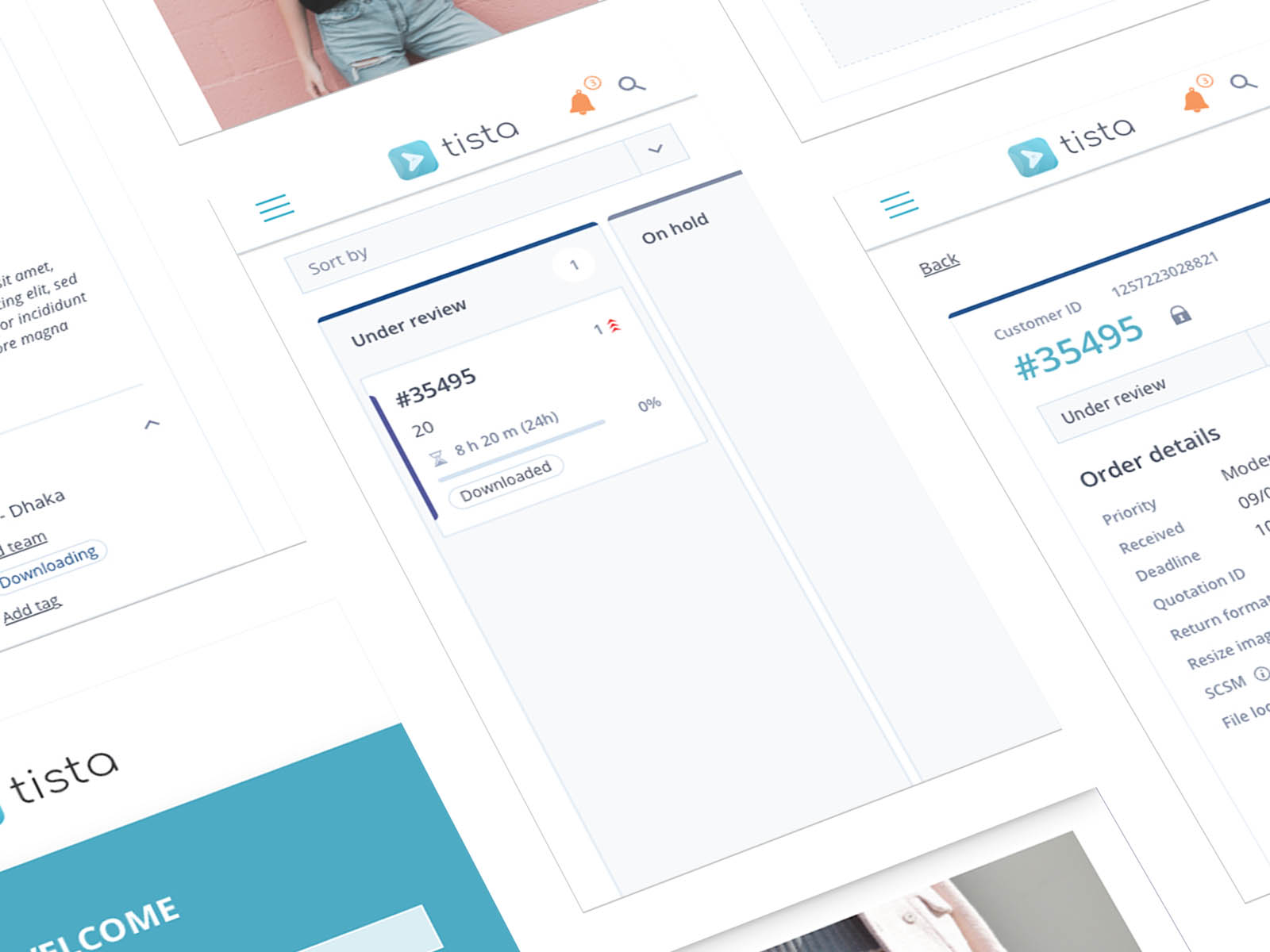
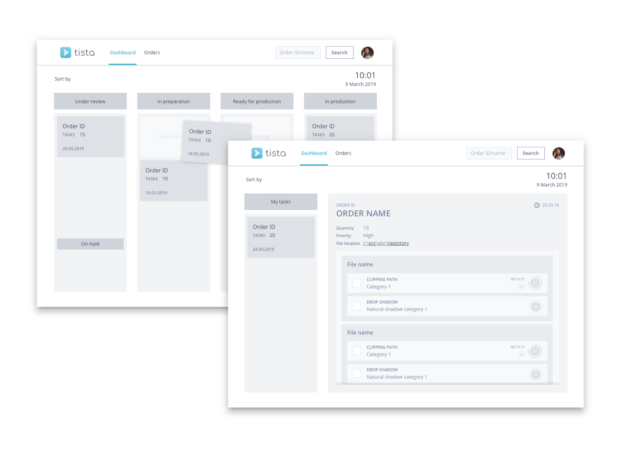
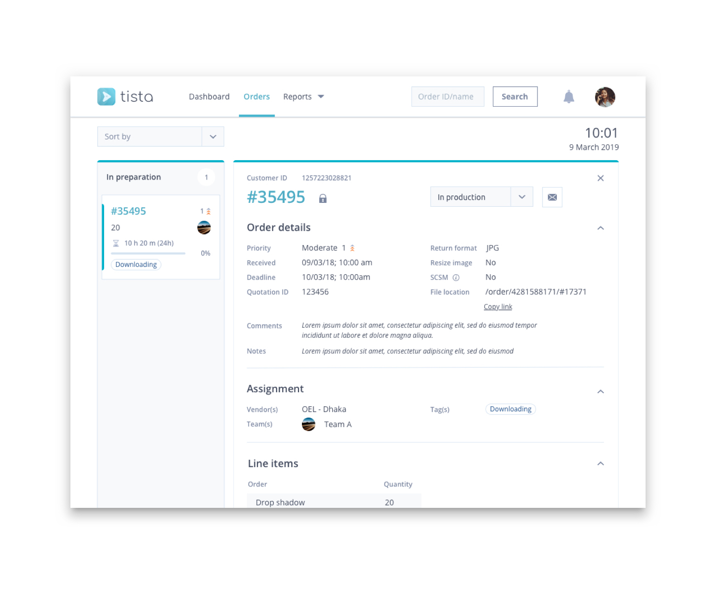
Orders page
These pages took the longest to refine, even though they look similar, there are 7 different order pages for each of the roles. They share the UI elements but different users can interact with them differently. For example, a TEAM MEMBER (designer) would be able to see assigned files to see what needs to be done and track their time, whereas a QC tester will receive files that need reviewing and either send them to a client or send them back for reworking.
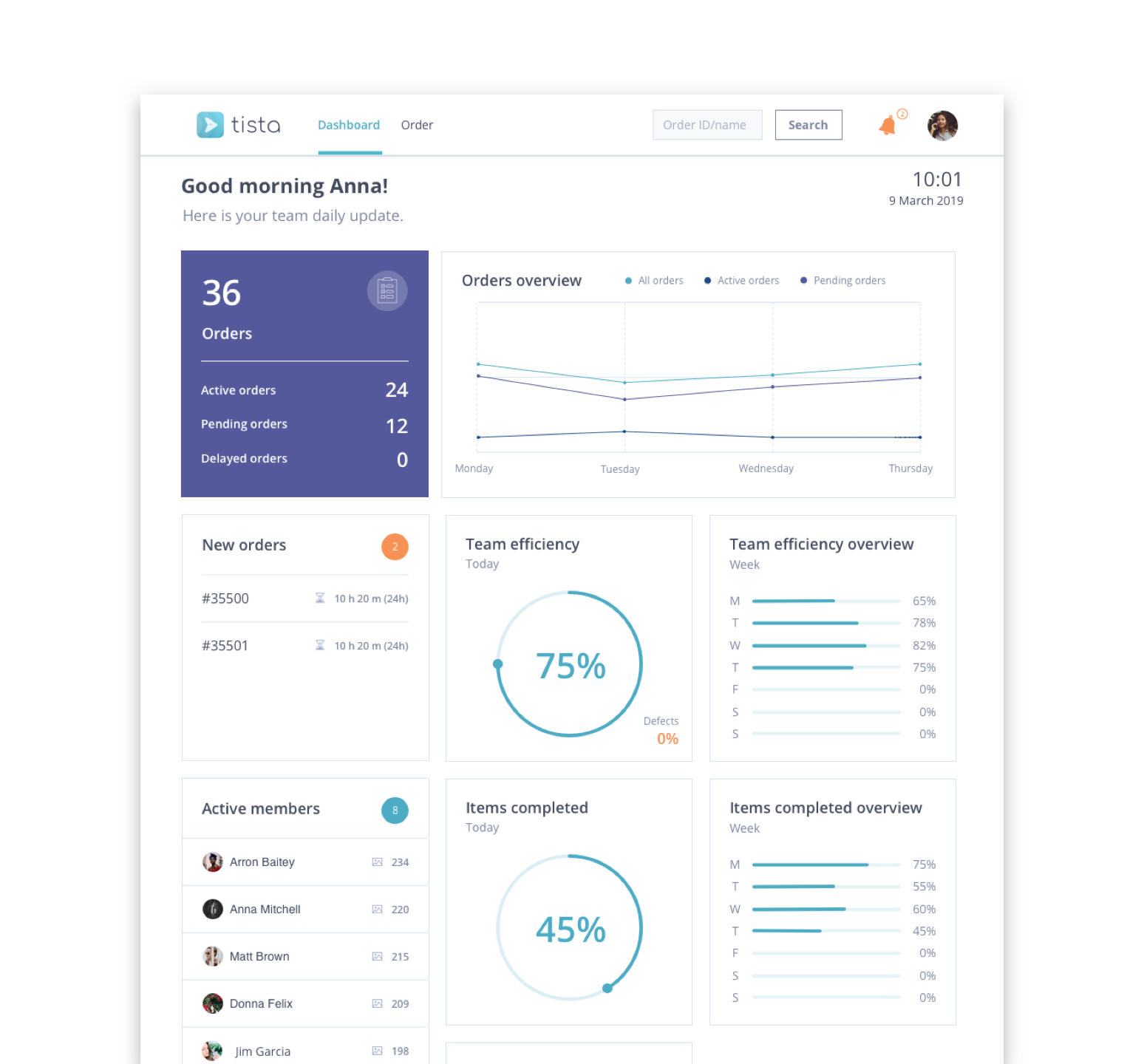
Dashboard
When a user logs into the app the welcome screen they see is their dashboard. Depending on the user role, the dashboard displays important information in an easy to understand way. Graphs are quick to understand and the page layout is distributed in a concise hierarchy.
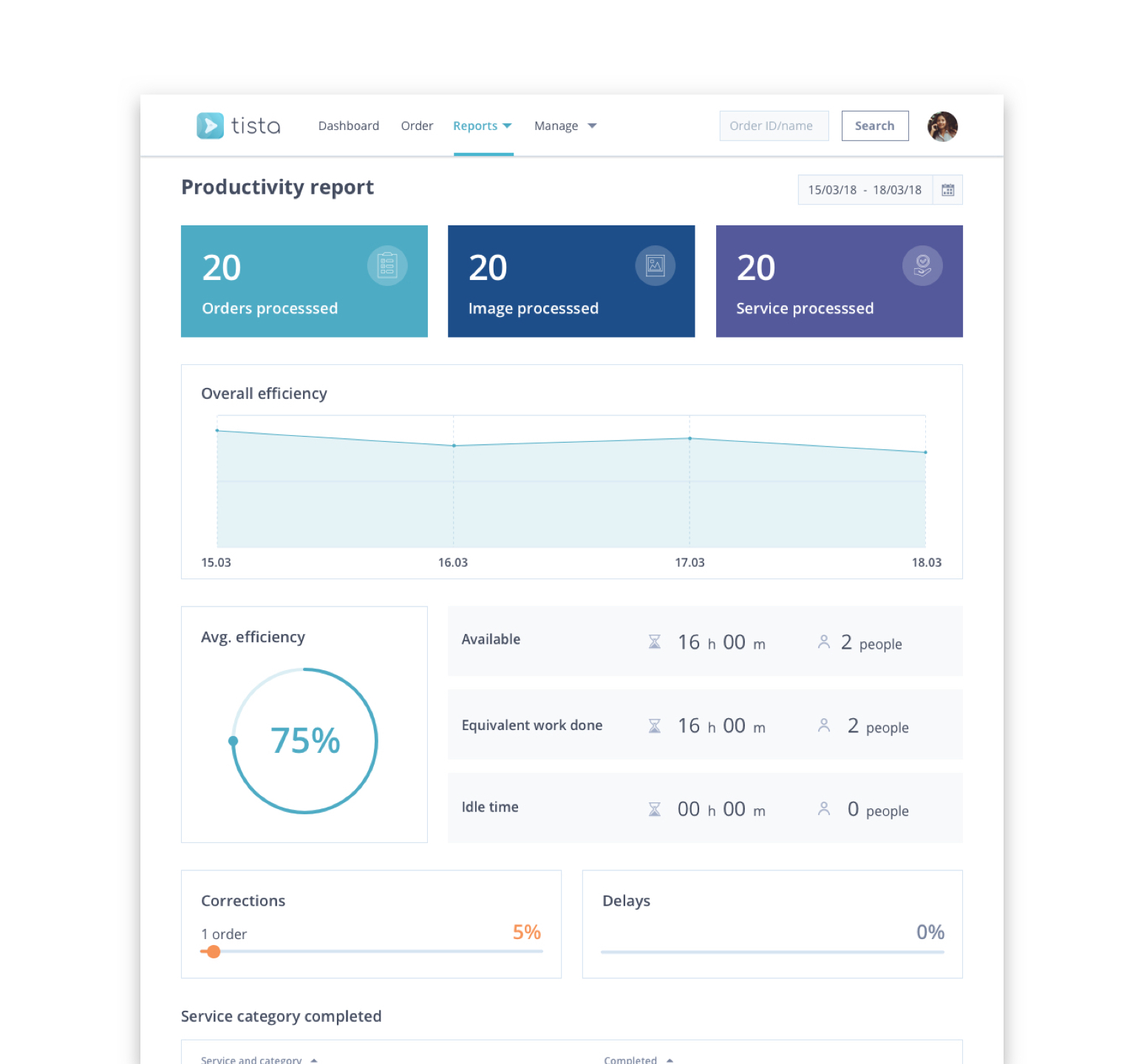
Productivity
One of the key screens for management is productivity page, where they can check the efficiency of their locations, teams and individual members.
This page will allow management to have an overview of efficiency across different dates, type of orders and teams.
Selected Works
Tista - Task managementWeb & mobile app
JobAppApp design
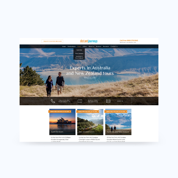
Distant JourneysWeb design
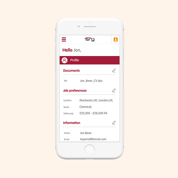
Registration & My accountWeb re-design
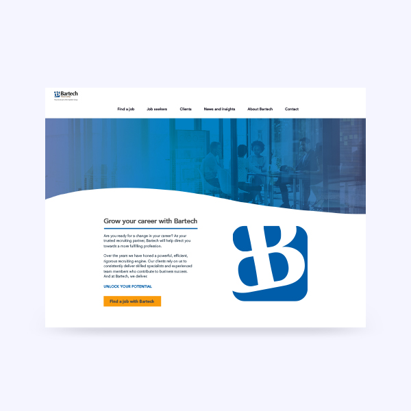
BartechWeb design
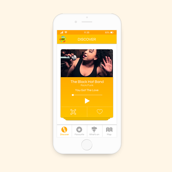
AMFApp design
PXI-eBranding
MetiDataWeb design and Development
Tate ApprenticeshipMarketing Campaign
Aviation Salary Survey 2018Publication

Beyond LuxuryBranding

FeniksTypeface design
Daily UIUI practice