Registration
& My account
UI/UX
Background
Impellam is an umbrella company with 18 recruitment agencies in various sectors. Each brand has its own website where candidates can register to search for jobs and get notifications. The data showed that many people didn't complete their registration process. The project was to improve the experience across all 18 brands.
Role
UX Researcher
Designer
Tools
Sketch
Optimal Workshop
Google analytics
Date
2018
Company
SRG
The challenge (Registration)
Each of the Impellam recruitment brands uses the same template for their website and they use a long registration form. Most of the questions on the form are not used by the recruiters and they make the process seem longer than it should be. Additionally, we wanted to fix the information architecture on 'my account' page to make it easier for users to find the most relevant information on that page.
The process
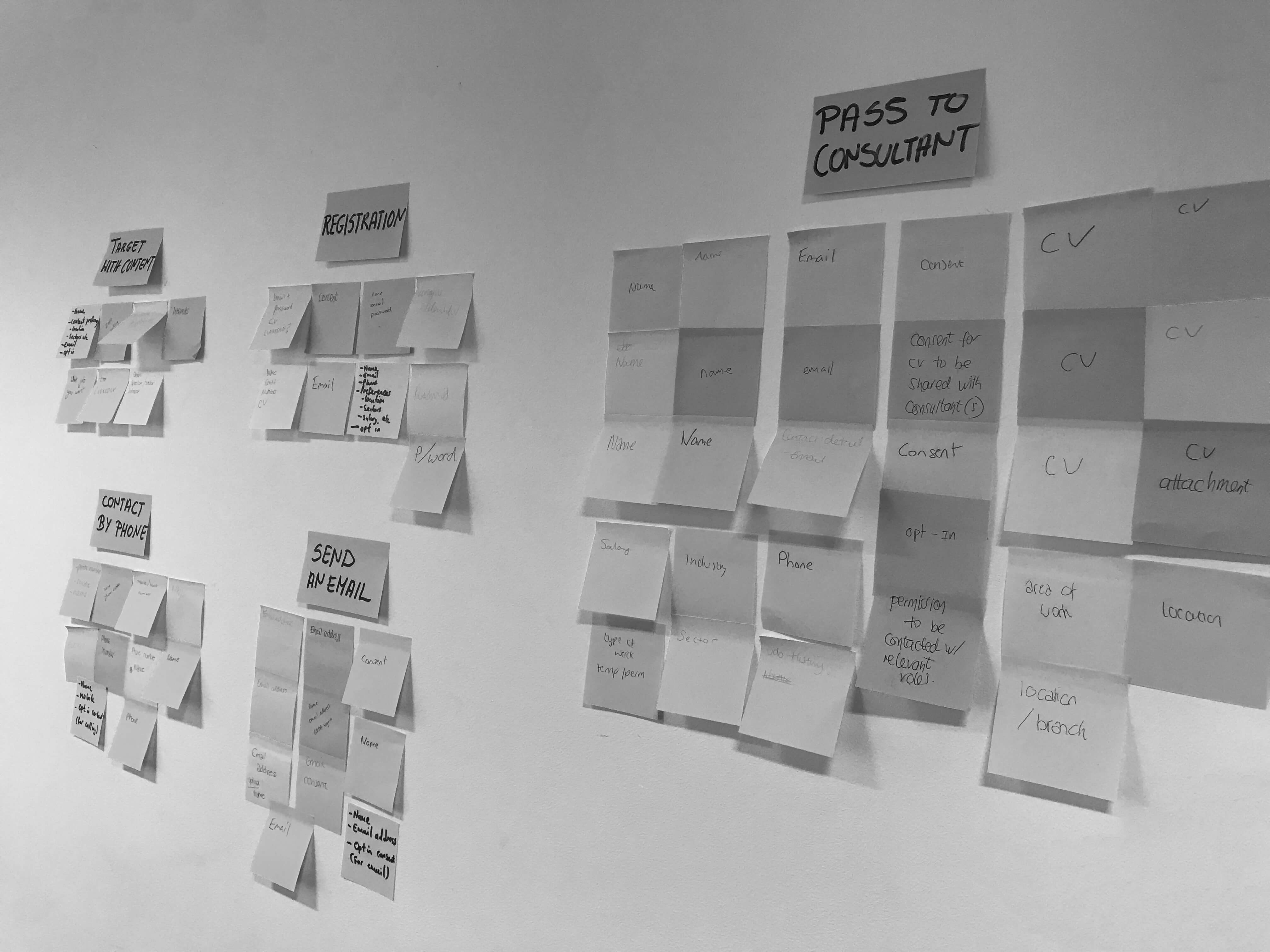
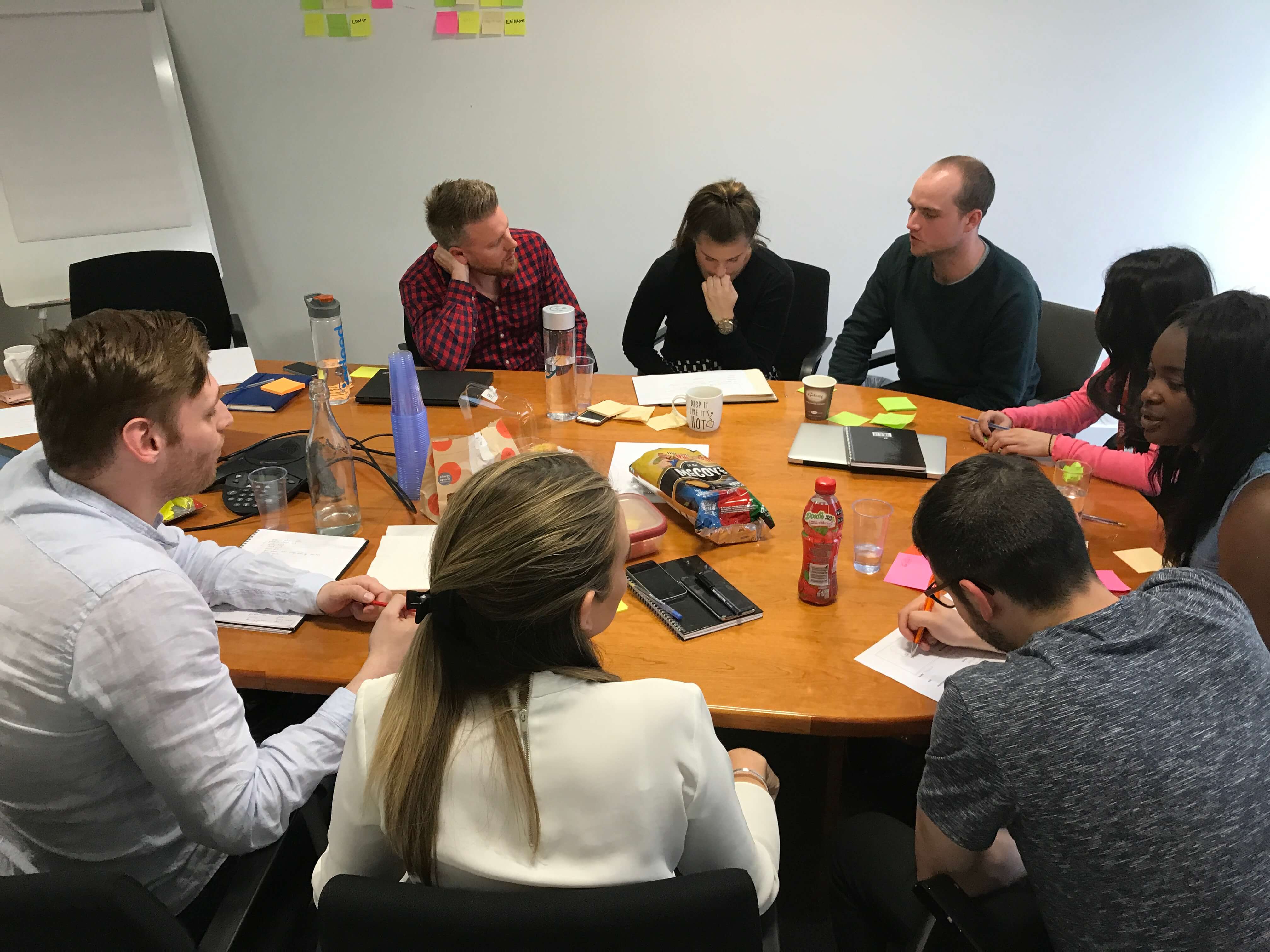
We couldn't just strip registration down to a bare minimum without making sure which of the information is valuable for each of the brands. To get everyone on the same page I organised a workshop with brand representatives, copywriters, data analysists and project managers.
The main reasons for people abandoning registration forms are:
1. They are time-consuming
2. They can be complicated
3. They ask for sensitive data which users might not want to share—such as phone number, credit card or address.
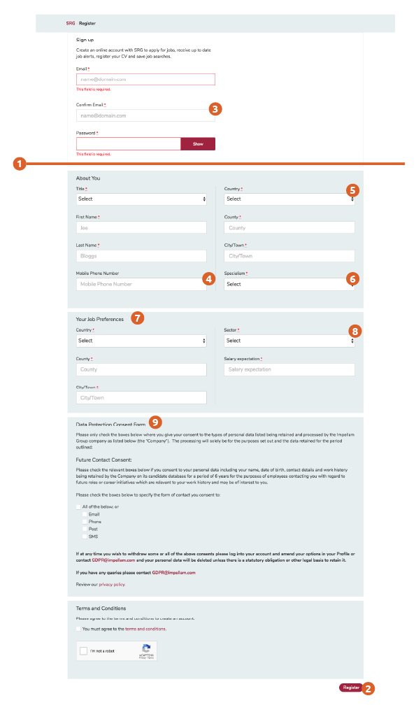
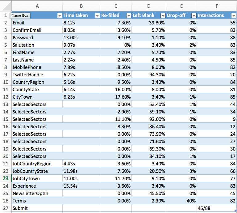
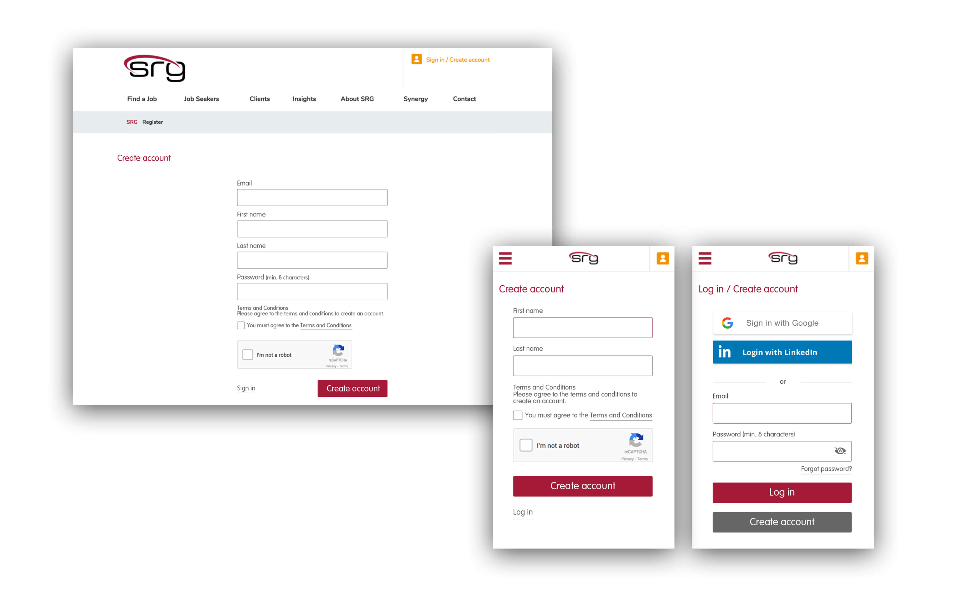
Current registration form required users to fill out 18 fields, and the 'Register' button was displayed at the very bottom of the long form which leads users to abandon the page. We have looked at competitors to see how they addressed the problem. With the new GDPR regulations companies have to include Data protection Consent forms on their websites, in this case, this element was very big.
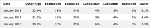
The statistics showed, that most people use a screen height between 768-900px. With that in mind, the current registration form gets cut off just below the Password field. At first glance, this might look confusing. But when the user scrolls all the way to the bottom, the important call to action ‘Register’ is displayed way below any screen size, at 1535px.
Data showed that most completed fields were:
•Email
•Password
•First name
•Last name
•Mobile number
•Sector
•Location
It also showed that 50% of people didn’t complete the registration!
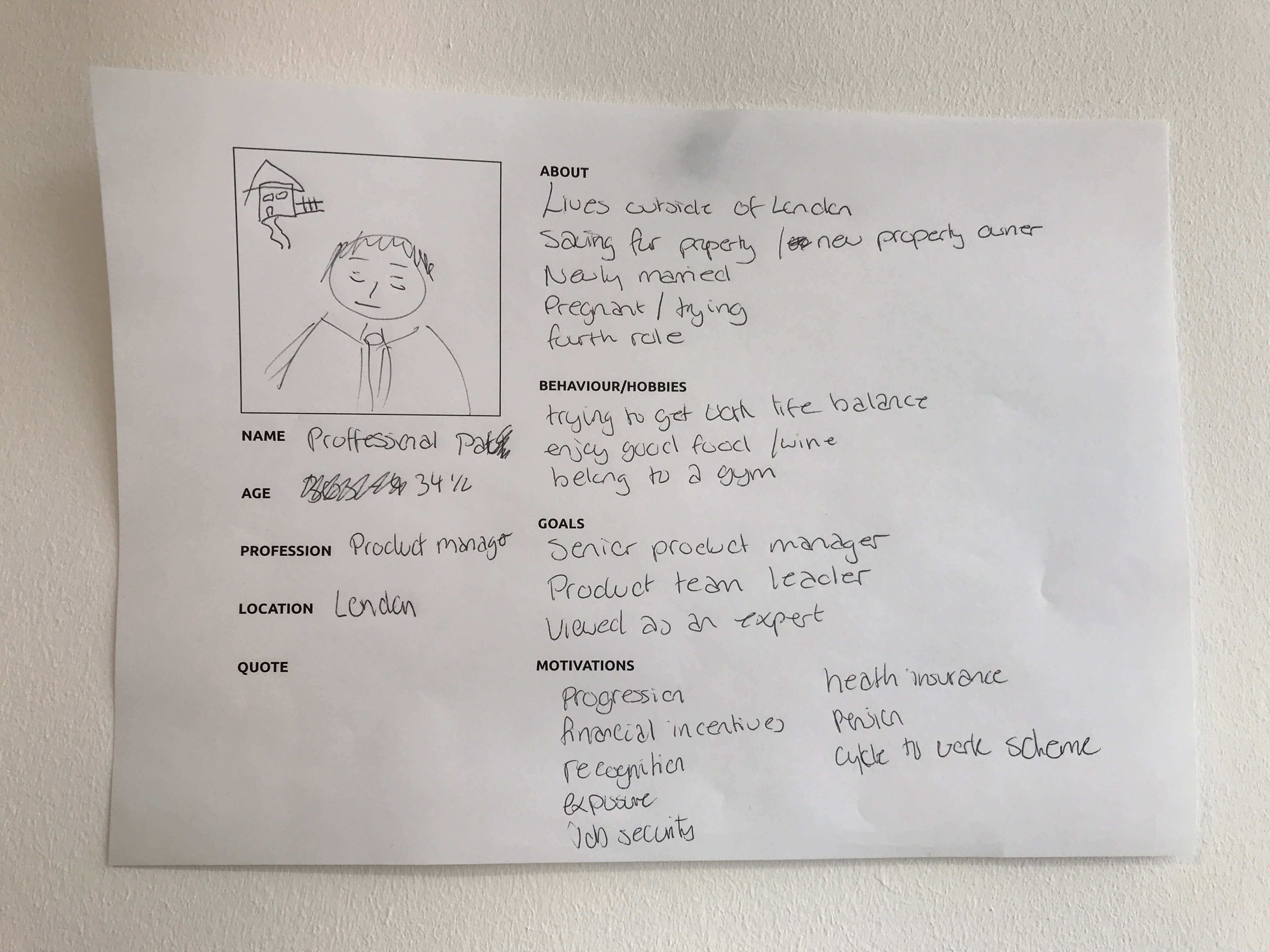
Data analysis highlighted information about the audience that visits the websites and where they come across issues. This also helped us understand who's our audience. We divided it into two groups of Professionals and Graduates, from this we created 2 personas. We looked at user needs and goals for these personas which helped our teams to empathise with them.
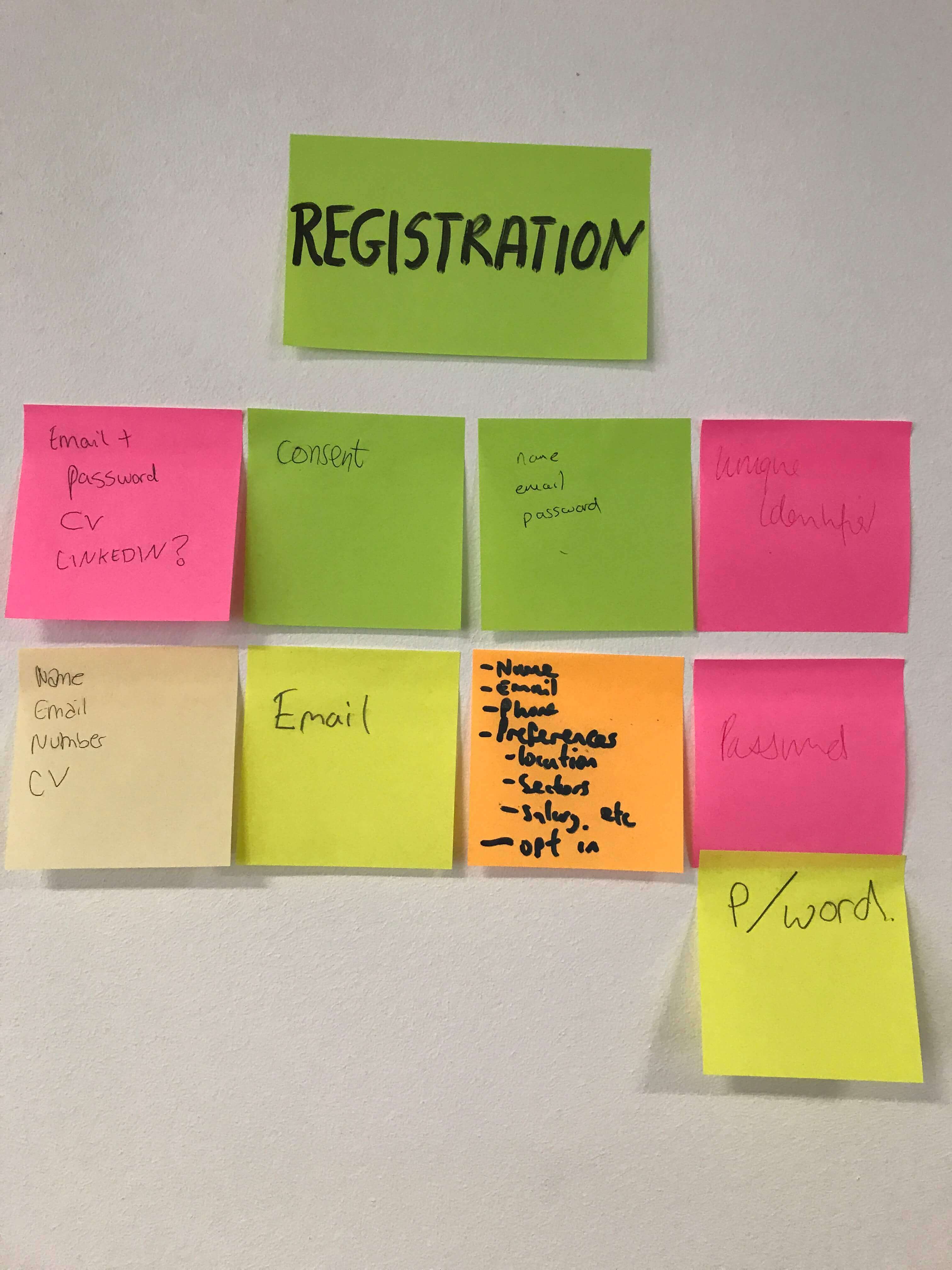
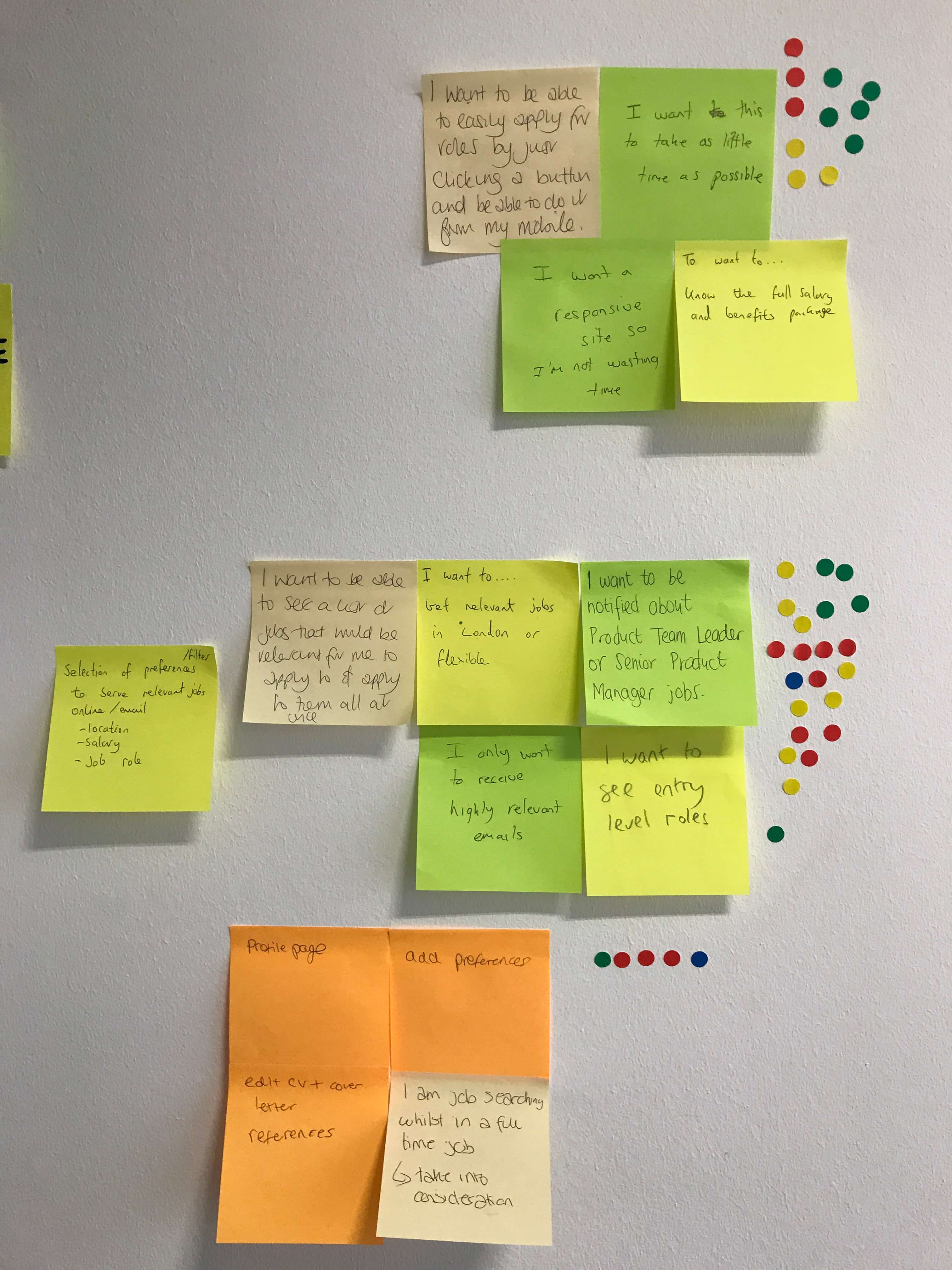
All participants had to write the questions they ask on their registration pages, we grouped them, and prioritized them. There was a clear understanding that we can make the process more efficient by reducing the number of fields required to register as well as adding a login with Google or Facebook.
The solution
The solution
We all agreed that the necessary registration elements are:
• Email
• Name
• Password
• Consent
and the later doesn't have to be that wordy.
The additional information like:
• Phone
• CV
• Type of work
• Location
• Name
• Sector
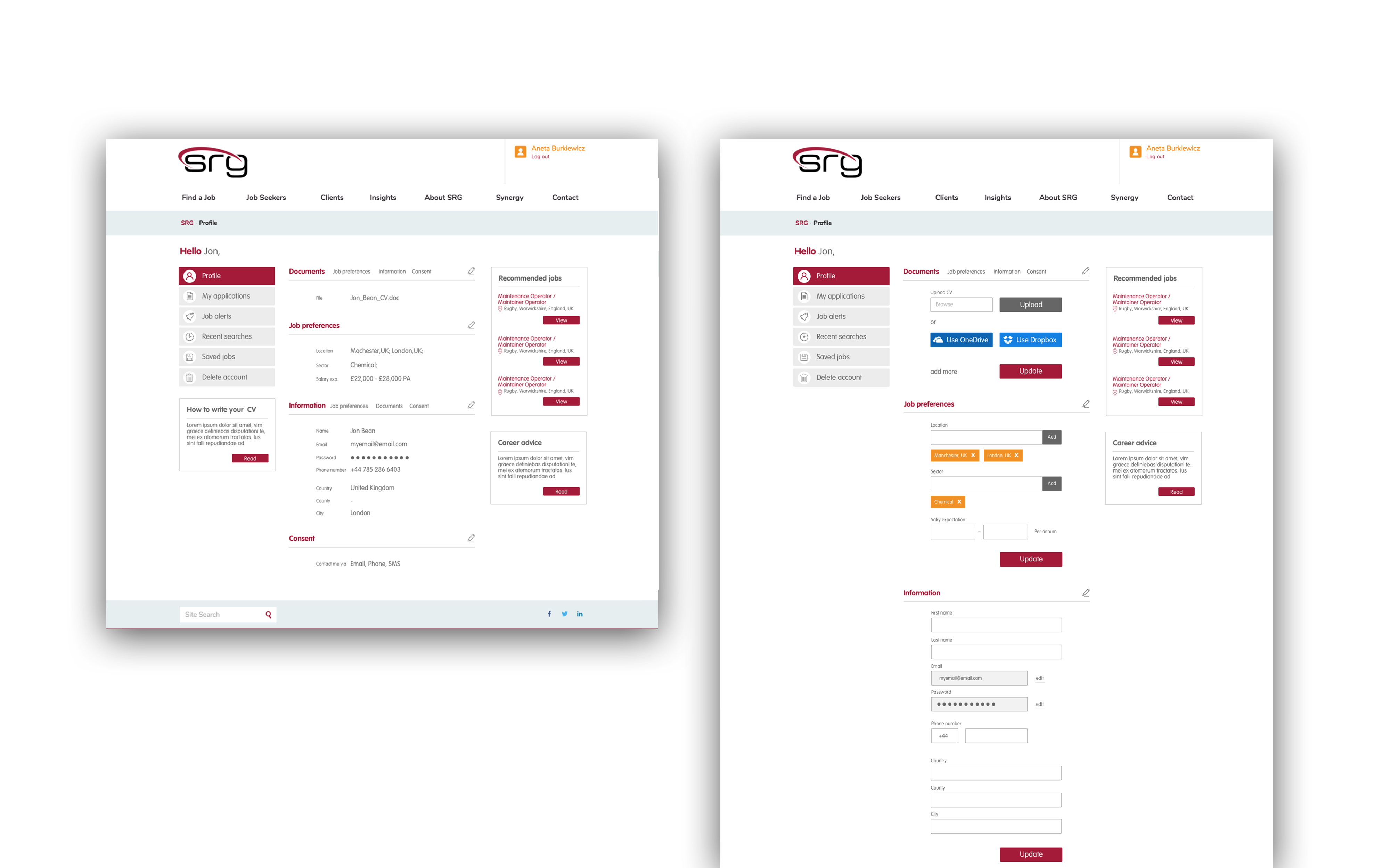
can be displayed on my account page, where users can complete their profile.
Takings from the workshop resulted in re-designing the registration process. New designs stripped down the form to the minimum number of fields that users need to fill in to create an account on the website. Some of the suggestions on how to improve the registration page were:
1. Registration button has to be prominent and above the fold
2. Autofocus - automatically activate the first fields (brand accent colour) to give user hint of where they should start
3. Instant form validation
4. The user should be able to sign-in at the registration page
5. The user has to receive a confirmation email to activate their account
6. Browser autofill should be enabled for faster completions
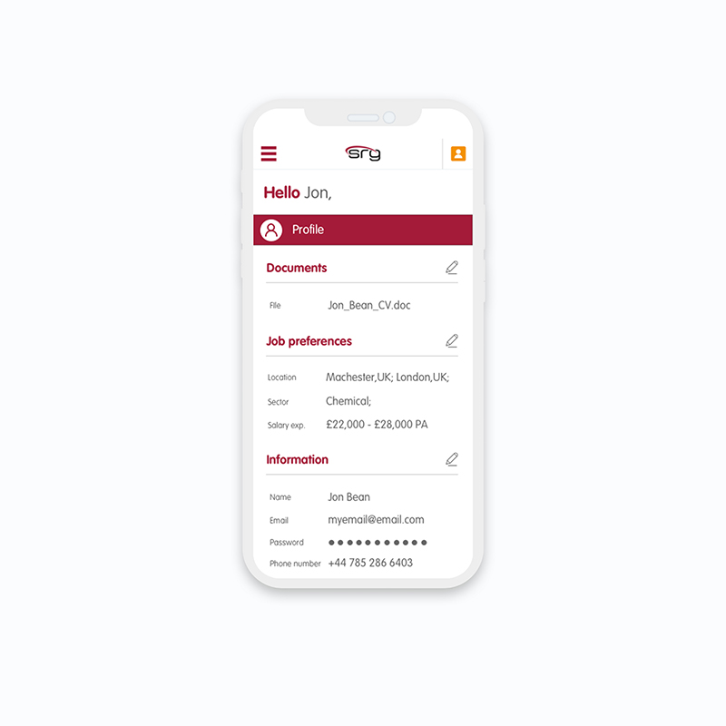
The challenge (My account)
The improvement of my account lays in changing its content and information architecture. From the Google Analytics stats below, we can see which features of my account have been used the most.
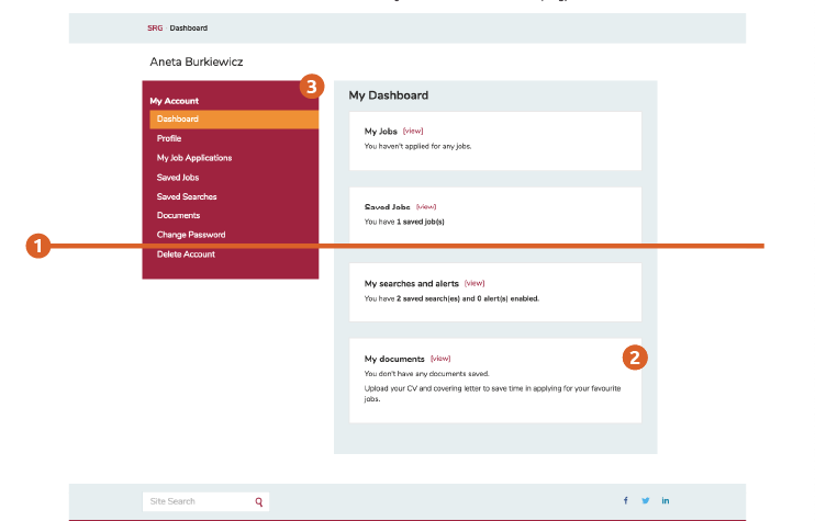
Currently, this isn’t displayed accordingly.
1. Fold line
2. Documents on both dashboard and side nav are not prioritized
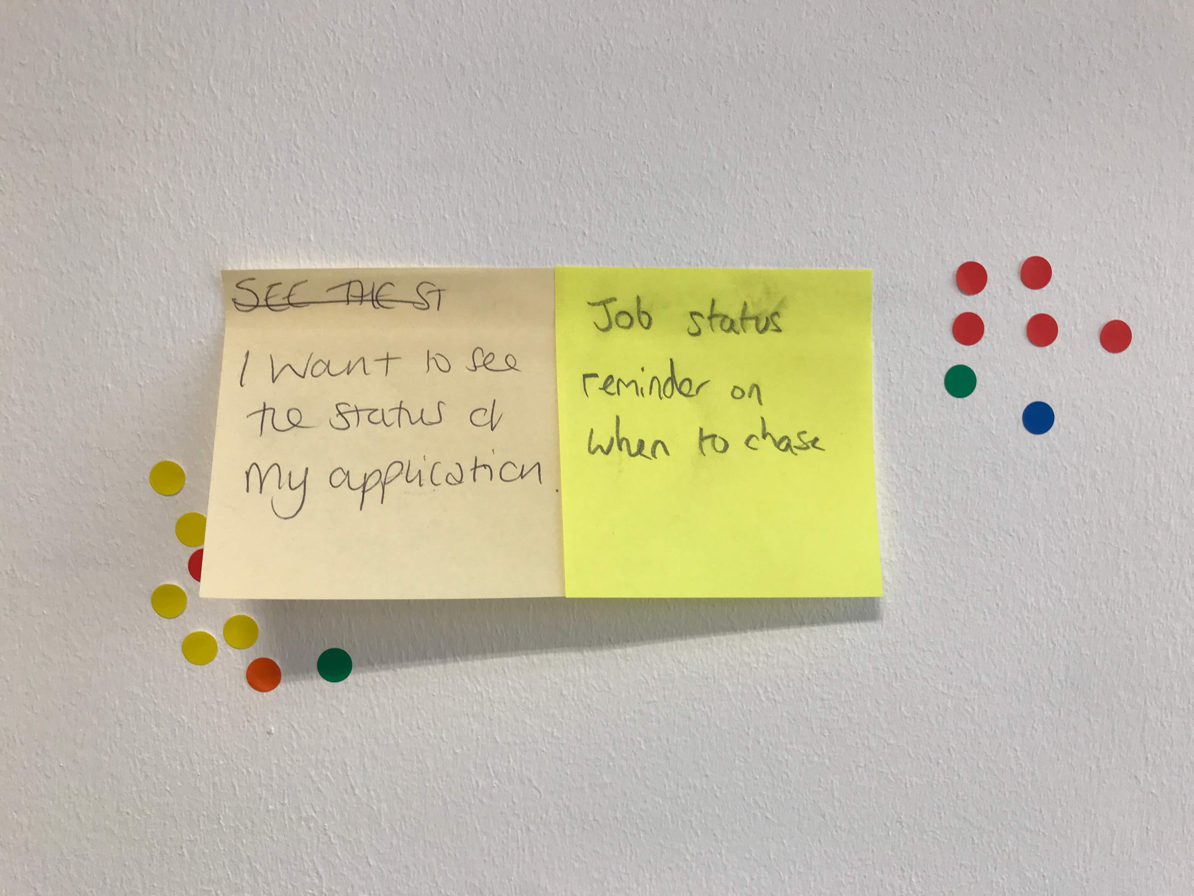
3. In feedback received from users, they would like to be able to set job alerts, this currently is not displayed as an option.
From users feedback we know that users want to be able to set job alerts, this feature should be incorporated into the new design.
We could also show featured jobs that are personalised for the candidate.
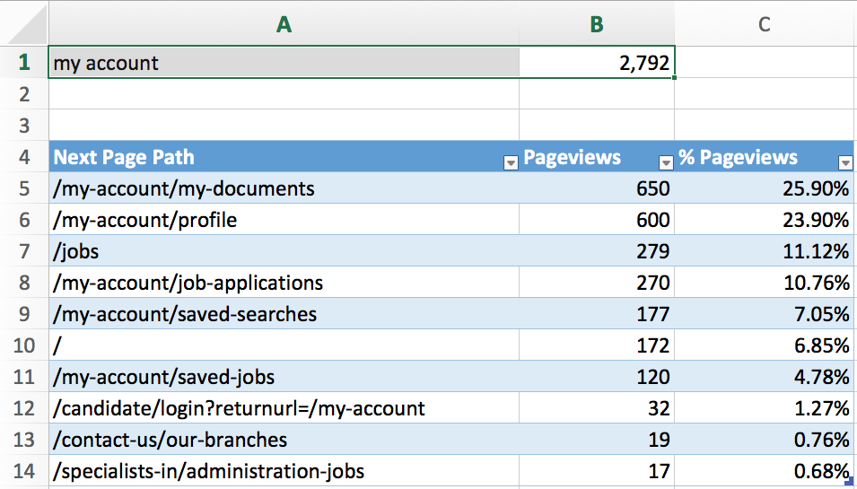
From the statistics we know which features users use the most.
List of features (in order of popularity):
- My documents
- Profile
- Job applications
- Saved searches
- Saved jobs
- My account
The process
With both personas in mind, the heat map results and users feedback from the website, we gathered ideas of tasks users would like to perform on ‘My account’ to create features and their prioritization.
The solution
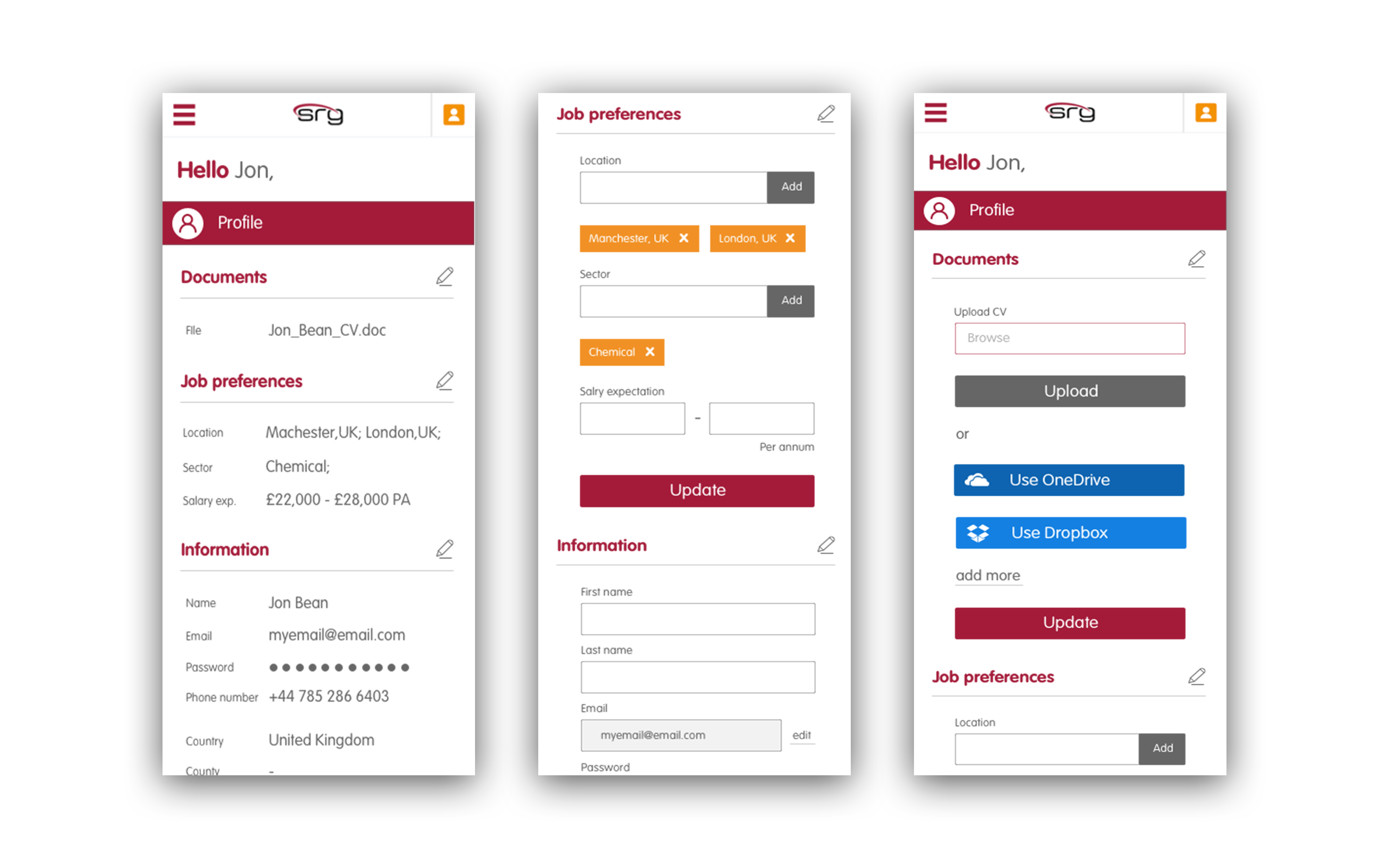
With all the data from Google Analytics and UX workshop, I have restructured the My account page. Additionally, we should change the look of the side nav as the block red background proved too distracting from the main content. Red buttons are iconically the main CTAs.
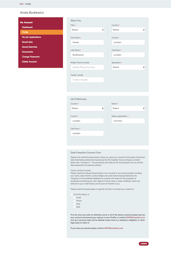
I included the possibility of adding more than one location to users preferences and the ability to load more than one document to the system. I have also incorporated featured jobs tailored for users and career advice that link to relevant blog posts.
Selected Works
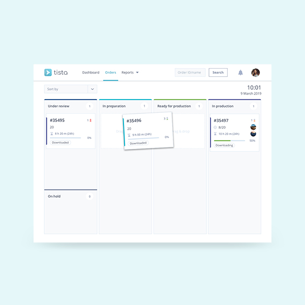
Tista - Task managementWeb & mobile app
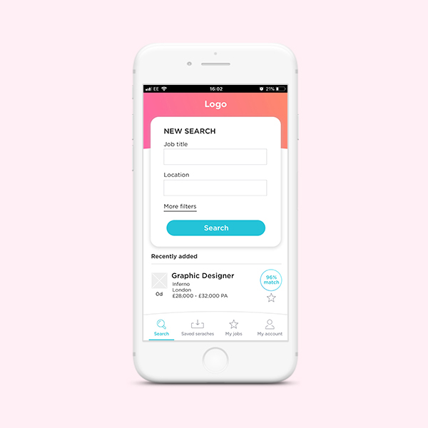
JobAppApp design
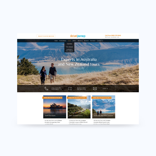
Distant JourneysWeb design
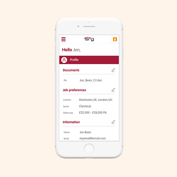
Registration & My accountWeb re-design
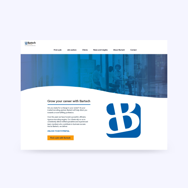
BartechWeb design
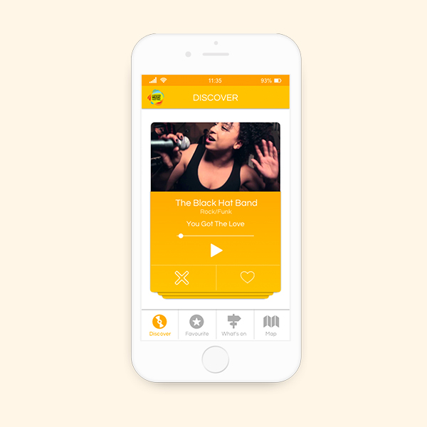
AMFApp design
PXI-eBranding
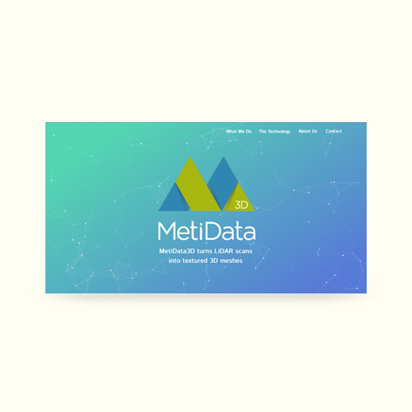
MetiDataWeb design and Development

Tate ApprenticeshipMarketing Campaign
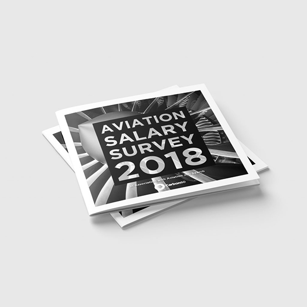
Aviation Salary Survey 2018Publication

Beyond LuxuryBranding

FeniksTypeface design
Daily UIUI practice